What are the Group Header Widget Properties
Group Header Widget
Group Header widget can be used to create a text header to divide your workflow in to sections. This can be useful when you have a long workflow. Dividing your workflow using the Group Header widget allows you to add relevant fields to a section for better understanding and flow. Workflows can contain more than one Group Header widget.
Group Header Widget—Properties
1. Header Title
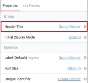 Header Title default value is Group Header (the name of the widget). Use the Header Title property in the right pane to name the section on your workflow. Example—Personal Information or Marketing Questions and add the relevant fields under that Header Title in your workflow.
Tooltip: The descriptive text or title displayed at the top of a section, page, or interface. It provides users with context about the content or purpose of the displayed information.
2. Initial Display Mode
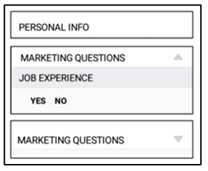
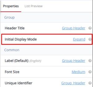 Initial Display Mode default value is Expand. Initial Display Mode is in the right pane and can be set to “Expand” on the workflow when collecting data or Header—and does allow you to collapse sections on the workflow. The gray triangle denotes whether information is displayed or collapsed. Examples—are shown below.
Tooltip: Specifies the default presentation state of an element or interface when it is first loaded or accessed. This mode defines how the content is initially displayed to users before any interactions or modifications occur.
Group Header Widget—Common Properties
Group Header Common Properties include—Label, Font Size, Place Holder, Required, Unique, Unique Identifier, Auto Advance, Custom ID, On Value Change, Hidden, Read-Only, Help Expanded, Increase Indent By, Visibility Conditions and Validity Conditions. Reference Text Box Widget—Common Properties for definitions and examples.