What are the Timestamp Widget Properties
Timestamp Widget
If you want your workflow to have Timestamp, then you can drag the widget from the left panel to the digital mobile screen in the middle. Timestamp, if used while filling the workflow, will capture the exact time of that particular moment – not just hours and minutes, but also seconds.
Date Format
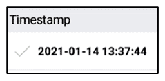
Date Format default value is Empty. Date Format property can be customized to display the date in the specified format to the user. Example—default displays as shown below:
Timestamp Widget—Properties
Mode
Mode default value is On Tap. Mode property displays a drop down list and includes On Open, On Tap, and On Submit. On Open—the Timestamp value is automatically populated when the workflow is opened to be completed. The Timestamp field is visible in the app when it is set to take the value on open. On Tap—the Timestamp value gets set when user taps on the Timestamp field in the workflow during data collection. On Submit—the Timestamp widget is not visible in the workflow. Even if the device if offline and a workflow record is completed, the Timestamp recorded is when the record is submitted.
Allow Changing
Allow Changing default value is No. Allow Changing property displays a drop-down list and includes No and Yes. Allow Changing property set to No—allows to the user to change the field one time. Allow Changing property set to Yes—allows the user to change the field multiple times.
Widget Layout
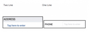
Widget Layout default value is Two Line. Use the Widget Layout property to set to name (label) and value to a single line or two lines. Example—Two Line layout displays the widget name (label) on one line and the value (to be filled in) on a second line. One Line layout displays the widget name (label) and the value to be filled in on a single line.
Time Stamp Widget—Common Properties
Date Time Widget Common Properties include—Label, Font Size, Place Holder, Required, Unique, Unique Identifier, On Value Change, Hidden, Value Display Mode, Default Help Mode, Increase Indent By, Visibility Conditions and Validity Conditions. Reference Text Box Widget—Common Properties for definitions and examples
Visibility Conditions Example—you might create a Timestamp which will be only visible if the user chooses ‘Yes’ option in the earlier choice list ‘Has the data collection process completed?’ Visibility conditions can help you control the type of input during the filling of a workflow by the user.
Validity Conditions Example—you might create a field ‘Timestamp Before Starting Audit’ which will be only valid if the user enters ‘Yes’ in the earlier field ‘Did you conduct process audit?’ Otherwise, it would be invalid and show an error message. Validations can help you control the type of input during the filling of a workflow by the user. You can also customize an error message that you want to display by typing the message in ‘Validity Error Message.’ This message will be displayed when the validity condition does not match with the given input. The error message could be “This field is applicable only when the process audit is conducted.”