What is Standardized Chart
Target charts are one vehicle for short-run charts, but target charts have some limitations, as mentioned in Section 4.2. Target charts must have plot points with the same subgroup size. Target charts also make the assumption that the standard deviation for each part is similar and that process average equals target, even though that is not necessarily the case. There is a type of charting for short-run applications that addresses these issues. These charts are called standardized charts.
The standardized chart is a universal short-run plotting technique. Compared to all other short-run plotting techniques, standardized charting stands out as the pre-eminent method because it is so flexible and easy to interpret. Standardized charts also have the advantage of being easier to learn and compare, since all control limits are at ±3.00 sigma limits. Standardized charts are based on techniques similar to normal x̄ & R charts. The difference is in how you plot values.
Standardized Formula for x̄ Charts
Let’s start out with the basic x̄ chart and work our way to the standardized chart. When charting x̄, the goal is to have an x̄ value that falls between the upper and lower control limits, which could be expressed by:
![]()
where the control limits are defined as:
![]()
And
![]()
The standardized 9 x̄ chart is based on the principle that control limits for any part on any process are always at ±3 standard deviations of the mean. The formulas for those control limits are as follows:
![]()
And
![]()
The standardized x̄ chart simply plots points relative to ±3σxx so that part size is not relevant to plot value. Upper and lower control limits on a standardized chart are always at ±3 respectively, with the centerline at 0. A plot point on a standardized chart is determined from the formula:
And

Standardized Formula for Range Charts
Finding the plot value for the range chart is a similar derivation to that for the x̄ plot value.
And
![]()
Note: None of the above formulas should be estimated with less than 10 samples (n=10).
The Plot Value
The plot value is the actual number that will appear on the chart; it is determined by plugging values into the plot value formula. Calculating the plot value is obviously not as simple as just calculating the average size. The plot value takes into account the subgroup size, the data grand average, and the process standard deviation. The advantage is that all parts can be put on one chart since the chart’s control limits range from ±3. Every part uses the same control limits.
Variable Subgroup Sizes
The standardized chart can handle a variable subgroup size easily. As the subgroup size varies, so does the σxL in the equation, but the physical chart stays the same. When using standardized charts, the standard deviation of different parts on the same chart can be different. The standard deviation becomes a factor in the plot value but makes no difference to the control limits on the actual chart.
Natural Boundaries
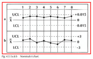
Another problem with the target chart, but solved with the standardized chart, occurs when charting a characteristic with a natural boundary, e.g., TIR for roundness. When measuring roundness, the target size is 0, but it is not possible to have parts with reading smaller than 0. This is shown in the target x chart of Figure 4.5.1a, where all the plotted points are above the centerline. Those unfamiliar with TIR and natural barriers might think that a trend (based on the number of consecutive points above double x-bar) was occurring. Looking at Figure 4.5.1b, we see a plot for the same type of information that is done in a standardized fashion. Note that the points on the standardized chart are more evenly distributed about the centerline of the chart.
Standardized Chart Centerline
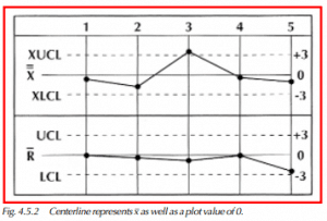
Notice that the centerline for the standardized chart shown in Figure 4.5.2 represents x as well as a plot value of 0. This does not mean that double x-bar equals 0, but that for a given value of x equal to double x-bar, the plot value will be 0 because there is no deviation from the mean. Also, notice that the control limits for the standardized x & R chart are fixed at ±3σ.
Using standard statistical techniques, we now have a method for low-volume, short-run manufacturers. Standardized x & R charts can be used to plot multiple parts of the same process on one chart. You can now chart multiple parts with different standard deviations and even with different sample sizes on a single chart. Interpretation of trends, patterns, and out-of-control points is the same for standardized charts as it is for x & R charts (Chapter 3).