What are the Date Time Widget Properties
Date Time Widget
The Date Time widget can be used to capture date and time during data collection on the mobile device workflow. To use the Date Time widget in your workflow, drag the widget from the left pane and drop it to the middle pane. Options available include Date time both (default), Date, Time, or Date Range.
Date Time Widget—Properties
1. Date Picker Type
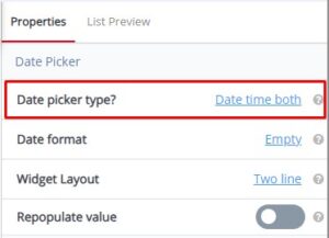 Date Picker Type default value is Date time both. Date Picker Type property allows different types of input during data collection on your workflow. The four types are Date, Time, Date Time Both and Date Range.
Tooltip: Specifies the style or format of the date picker used in a user interface
| Date—Select Date to allow you to choose date only when you complete your workflow. | Time—Select Time to allow you to choose time only when you complete your workflow. | Date Time Both—Select Date Time Both to allow you to choose both date and time when you complete your workflow. | Date Range—Select Date Range to allow you to select a date range (from a particular date—to a particular date) when completing you workflow.
|
2. Date Format
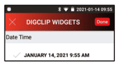
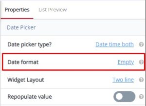 Date Format default value is Empty. Date Format property can be customized to display the date in the specified format to the user. The default date format in Month, Day, Year, Hour, Minutes AM (PM). Example—January 14, 2021 9:55 AM
Tooltip: Determines how the date is displayed or entered, defining the arrangement of day, month, and year. It ensures consistency in date representation, allowing users to understand and input dates correctly. Common formats include MM/DD/YYYY or DD/MM/YYYY.
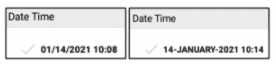
Additional Example—Date Format property set to MM/dd/yyyy HH:mm—displays 01/14/2021 10:08. Date Format property set to dd-MMMM-yyyy H:mm—displays 14-JANUARY-2021 10:14
For more details on date format patterns, you can refer to the link below:
https://help.gooddata.com/cloudconnect/manual/date-and-time-format.html
3. Widget Layout
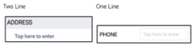
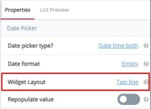 Widget Layout default value is Two Line. Use the Widget Layout property to set to name (label) and value to a single line or two lines. Example—Two Line layout displays the widget name (label) on one line and the value (to be filled in) on a second line. One Line layout displays the widget name (label) and the value to be filled in on a single line.
Tooltip: Allow widget name and value to be in single line or two line
4. Repopulate Value
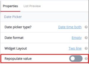 Repopulate Value default toggle value is No. Use the Repopulate Value property to automatically repopulate (ditto) the previously submitted value. Example—Yes will remember the previously entered value and automatically populate the field every time a new Workflow is opened for data collection (user can manually change and this will become the new repopulate value); No will display the field blank every time a new Workflow is opened for data collection.
Tooltip: Enables the automatic filling of a field with a predefined or previously entered value. When selected, the field is populated with the specified value, enhancing efficiency in data entry and ensuring consistency across interactions. Users can save time by not having to re-enter the same information repeatedly.
Date Time Widget—Common Properties
Date Time Widget Common Properties include—Label, Font Size, Place Holder, Required, Unique, Unique Identifier, Auto Advance, Custom ID, On Value Change, Hidden, Read-Only, Help Expanded, Increase Indent By, Visibility Conditions and Validity Conditions. Reference Text Box Widget—Common Properties for definitions and examples.
Visibility Conditions Example—you might create a Date Time Field ‘Inspection End Date’ which will be only visible if the user chooses ‘Yes’ option in the earlier choice list ‘Did Inspection End on Different Date from That of a Start Date?’ Visibility conditions can help you control the type of input during the filling of a workflow by the user.
Validity Conditions Example—you might create a field ‘Inspection End Date’ which will be only valid if the user enters ‘Yes’ in the earlier field ‘Did the inspection long for more than a day?’ Otherwise, it would be invalid and show an error message. Validations can help you control the type of input during the filling of a workflow by the user. You can also customize an error message that you want to display by typing the message in ‘Validity Error Message.’ This message will be displayed when the validity condition does not match with the given input. The error message could be “This field is applicable only if the inspection ends on a different date.”