What are the Cause and Effect Diagrams (Ishikawa Diagrams)
Dr. Kaoru Ishikawa (1915-1989), a noted Japanese authority on quality and productivity, developed these diagrams for problem-solving. A more complete explanation of these diagrams can be found in his book, Guide to Quality Control, 1976. A cause-and-effect diagram is a simple technique for dissecting a problem or process. Making a diagram is possibly the best first step in analyzing a problem prior to data collection. Diagrams organize thinking and provide a plan of attack. There are three types of cause-and-effect diagrams:
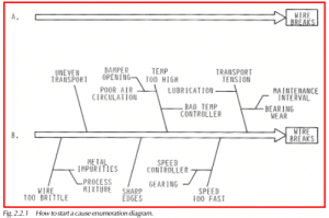
- Cause enumeration diagram — A graphic diagram used to list all the possible causes of a problem.
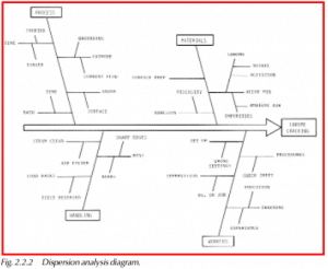
- Dispersion analysis diagram — A diagram used to analyze the causes of variability in a process.
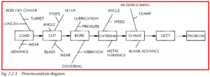
- Process analysis diagram — A flow diagram used to study quality problems.
The three diagrams look nearly alike. The dispersion analysis and process analysis diagrams are derivatives of the basic cause enumeration diagram, and they are used to highlight process control problems.
Cause Enumeration Diagram
To create a cause enumeration diagram, first put the problem on the extreme right side of the page, as in Figure 2.2.1. Then draw a long-stemmed arrow to it. Along the stem of the arrow draw smaller arrows and label them with the possible causes. It is important to list all possible causes; put down everything that comes to mind. A good diagram will look extremely complicated and busy; however, if everything is included on the chart, the true causes of the problem should be listed.
For a compound problem, several diagrams may be necessary. Later we might be able to combine the diagrams and organize the causes using some criterion, such as the cause’s relative importance, or the sequence of events. When investigating the causes, we use the diagram to note progress. We may be able to eliminate most causes, or even add a few that were not described.
Dispersion Analysis Diagram
To make a dispersion analysis diagram, start with the problem on the right and draw an arrow to it, as shown in Figure 2.2.2. List the main groups that influence the problem by their general category — workers, materials, tools, inspection, and machinery. Next, draw arrows to the branches and label them, detailing variability contributors. This organizes the causes into categories that can be studied one at a time. We must then keep asking, “Why does the dispersion occur?” as we look at each variable on our diagram. This keeps us focused on what we want to accomplish— minimizing the variation.
Benefits of Ishikawa Diagrams
Ishikawa diagrams graphically illustrate all the influencing factors of a problem. By putting the problem on paper, everything becomes known and can be studied. Of course, the main weakness of a diagram is that its accuracy depends on the person or group that draws it. This is why it is very important to get input from all individuals involved with the process. The different ideas generated by these people will often lead to a more complete picture of the causes actually present. The benefits of Ishikawa diagrams can be summarized as follows:
- They allow full disclosure of variability factors beyond the suspected obvious ones.
- They provide a simple plan of attack. Each cause can be investigated and eliminated if not important.
- They provide an ongoing record of when actual relationships were identified and when corrections were made.
- They are relatively complete.