Last Updated on September 18, 2023 by Ossian Muscad
Presenting and understanding complex data is a critical skill in today’s data-driven world. Harnessing the power of data visualization graphs can provide a comprehensive perspective of data, unveiling patterns, correlations, and trends that might go unnoticed in raw, text-based data.
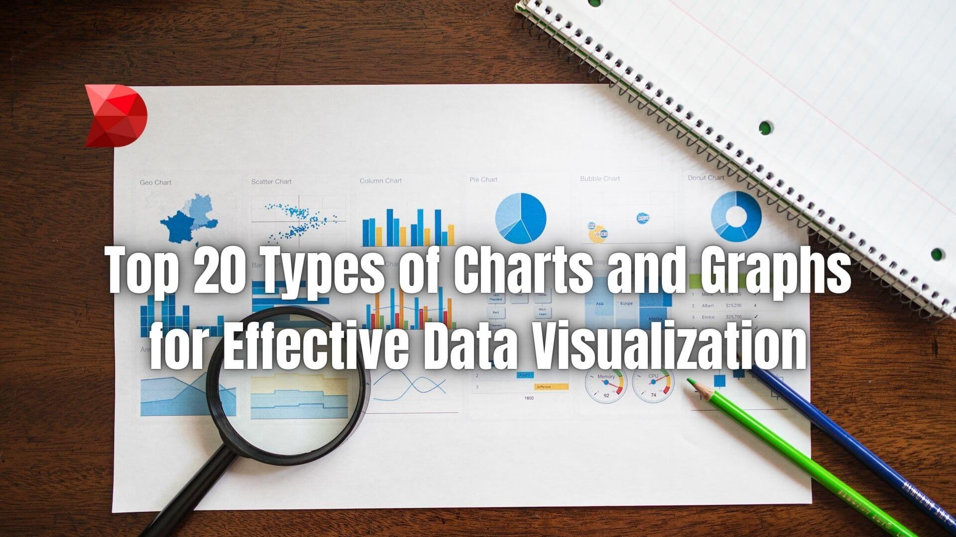
This article will explore 20 different types of graphs and charts, each with unique strengths, that can serve as powerful data analysis and communication tools. This overview will benefit anyone looking to effectively leverage data visualization to drive their business forward.
What are Data Visualization Graphs?
Data visualization graphs are graphical representations of information and data. Using visual elements like charts, graphs, maps, and more, data visualization tools provide an accessible way to see and understand trends, outliers, and patterns in data. From simple bar graphs to complex heatmap representations, different types of data visualization graphs can be used to communicate quantitative insights effectively.
These visualizations allow businesses to interpret their data quickly, make informed decisions, and present their findings in a digestible manner. This can lead to better strategies, improved operations, and increased growth.
Significance of Data Visualization Graphs
Data visualization graphs hold immense importance in the business world and beyond for several reasons:
- Simplification of Complex Data: Data visualization graphs simplify complex datasets, making them more comprehensible and manageable.
- Faster Data Analysis: They allow for rapid interpretation of data, saving significant time compared to sifting through spreadsheets or reports.
- Identification of Patterns and Correlations: They help identify emerging patterns, relationships, and trends in data that might be less discernible in text-based data.
- Data-Driven Decision Making: They support data-driven decision-making processes by providing clear, visual representation of actionable insights.
- Enhanced Communication: They facilitate more effective information communication to various stakeholders, from team members to clients and investors.
- Problem Recognition and Solving: They aid in recognizing areas that need attention or improvement, thereby helping in problem-solving.
- Performance Measurement: They provide an efficient way to monitor and measure the operational efficiency of business processes.
- Prediction of Trends: They can help predict future trends by showcasing data trends and patterns over time.
20 Types of Data Visualization Graphs
One thing you will notice when researching data visualization tools is the sheer number of different types of graphs available. Here are 20 commonly used data visualizations that any business can use to make informed decisions:
Bar Graph
A bar graph, or a bar chart, is a basic type of chart that displays categorical data with rectangular bars of lengths proportional to the values they represent.
When to Use It
Bar graphs are incredibly versatile and can compare quantities among different categories.
Pros and Cons
Pros:
- Easy to understand
- Provides direct comparison
Cons:
- Not suitable for large datasets
Line Graph
Line graphs display data or information that changes continuously over time.
When to Use It
Line graphs are ideal for showing trends, correlations, and patterns over a specified period.
Pros and Cons
Pros:
- Good for showing trends over time
- Can display multiple datasets on one graph
Cons:
- Not suitable for categorical data
Pie Chart
A pie chart is a captivating circular graphic that communicates numerical proportions by dividing it into slices. This visual representation efficiently showcases data, making it easy to comprehend and analyze statistical information.
When to Use It
Pie charts are great for showing how parts make up a whole.
Pros and Cons
Pros:
- Visually appealing
- Easily compares proportions
Cons:
- It can be misleading if not proportioned correctly
Histogram
A histogram offers a precise depiction of the distribution of numerical data, capturing its essence with accuracy and clarity.
When to Use It
Histograms are best for showing the distribution of data points within a dataset.
Pros and Cons
Pros:
- Shows data distribution
- Useful for large data sets
Cons:
- Not suitable for comparing different data sets
Scatter Plot
Scatter plots utilize dots to visually depict values for two distinct numeric variables. The placement of each dot along the horizontal and vertical axes corresponds to the values of an individual data point. This graphical representation offers a succinct and intuitive way to analyze relationships and patterns within the data.
When to Use It
Scatter plots are a valuable visual tool for illustrating the correlation between two variables.
Pros and Cons
Pros:
- Shows correlation between variables
- Can identify outliers
Cons:
- Not as visually engaging as other graphs
Area Chart
An area chart, also known as an area graph, visually represents quantitative data in a graphical format. This aesthetic and informative visualization method effectively communicates numerical information in a captivating and easily understandable manner. It’s similar to a line graph but with the area below the line filled in.
When to Use It
Area charts represent cumulative totals using numbers or percentages over time and are commonly used to show trends over time among related attributes.
Pros and Cons
Pros:
- Shows part to whole relationships
- Shows trends over time
Cons:
- Not suitable for large data sets
Bubble Chart
A bubble chart is a scatter plot variation displaying three data dimensions. The third data set is displayed as the size of the bubble.
When to Use It
Bubble charts compare and show the relationships among the values of three variables on a two-dimensional diagram.
Pros and Cons
Pros:
- Visually appealing
- Shows complex data in a simple way
Cons:
- It can be hard to read
Stacked Bar Chart
A stacked bar chart (or stacked bar graph) is a chart that uses bars to show comparisons between categories of data but with the ability to break down and compare parts of a whole.
When to Use It
Stacked bar charts are used to compare the quantity of different categories and display the composition of each category.
Pros and Cons
Pros:
- Shows part to whole relationships
- Shows composition of data
Cons:
- Comparing each data series can be challenging.
Treemap
A treemap is a chart resembling the branches of a tree that shows hierarchies and part-to-whole relationships.
When to Use It
Treemaps are used when you want to visualize hierarchical data across two dimensions.
Pros and Cons
Pros:
- Efficient use of space
- Shows hierarchy and part-to-whole relationships
Cons:
- Hard to compare each data series
Waterfall Chart
A waterfall chart is a data visualization tool that effectively illustrates the cumulative impact of sequentially introduced positive or negative values. It aids in comprehending the overall influence these values have on the data set, providing valuable insights.
When to Use It
Waterfall charts are used for understanding the gradual transition of a quantitative variable.
Pros and Cons
Pros:
- Shows cumulative effect
- Shows gradual transition
Cons:
- It can be complex to read
Radar Chart
A radar chart displays multivariate data as a two-dimensional chart of three or more quantitative variables represented on axes starting from the same point.
When to Use It
Radar charts are used to compare multiple quantitative variables.
Pros and Cons
Pros:
- Compares multiple variables
- Shows qualities of data
Cons:
- It can be hard to read
Box Plot
A box plot is a powerful visual representation used to illustrate groups of numerical data by showcasing quartiles. Whiskers, represented by lines extending vertically from the boxes, provide insight into variability beyond the upper and lower quartiles. This method not only enhances readability but also adds eloquence to the depiction of data.
When to Use It
Box plots are used to show a data set’s spread and skewness and identify potential outliers.
Pros and Cons
Pros:
- Shows data spread and skewness
- Identifies potential outliers
Cons:
- It doesn’t show frequency.
Heat Map
A heat map is a data visualization technique showing a phenomenon’s magnitude as color in two dimensions. The color variation may be by hue or intensity, giving visual cues about how the phenomenon is clustered or varies over space.
When to Use It
Heat maps show relationships between two items, displaying the magnitude of a phenomenon as color.
Pros and Cons
Pros:
- Shows intensity of relationships
- Visually appealing
Cons:
- Not suitable for large data sets
Funnel Chart
A funnel chart is a type of chart often used to represent stages in a sales process and show the amount of potential revenue for each stage.
When to Use It
Funnel charts are used to visualize stages in a sales or marketing process.
Pros and Cons
Pros:
- Shows stages in a process
- Shows potential revenue
Cons:
- Not suitable for all types of data
Pie Chart
A pie chart is circularly divided into sectors, illustrating numerical proportions.
When to Use It
Pie charts are excellent for displaying simple proportional part-to-whole data.
Pros and Cons
Pros:
- Shows proportions clearly
- Simple and easy to understand
Cons:
- It can be misleading with too many sectors
Doughnut Chart
A doughnut chart is a circular chart with a blank center showing proportional data segments.
When to Use It
Doughnut charts are similar to pie charts and can be used to compare parts-to-whole data.
Pros and Cons
Pros:
- Can handle multiple data series
- Visually appealing
Cons:
- Not suitable for detailed comparison
Gantt Chart
A Gantt chart is a graphical representation that effectively showcases the schedule of a project, utilizing bars to represent various tasks and their timelines. This visual tool provides a clear and concise depiction of project progression.
When to Use It
Gantt charts represent the duration of tasks against the progression of time.
Pros and Cons
Pros:
- Shows overlapping events
- Visualizes project timelines
Cons:
- It can become complicated with too many tasks
Pareto Chart
A Pareto chart contains both bars and a line graph, where individual values are represented in descending order by bars, and the line represents the cumulative total.
When to Use It
Pareto charts highlight the most important factors, often following the 80/20 rule.
Pros and Cons
Pros:
- Prioritizes influencing factors
- Shows the frequency of factors
Cons:
- Not suitable for large data sets
Sankey Diagram
A Sankey diagram is a specific type of flow diagram in which the width of the arrows is shown proportionally to the flow quantity.
When to Use It
Sankey diagrams are used in process engineering and energy management to visualize energy material or cost transfers between processes.
Pros and Cons
Pros:
- Visualizes material, energy, or cost transfers
- Shows quantity flow and proportions
Cons:
- Not suitable for simple data sets
Choropleth Map
A choropleth map is a thematic map in which areas are shaded or patterned in relation to a data variable.
When to Use It
Choropleth maps are used for geographic data distributions.
Pros and Cons
Pros:
- Visualizes geographic distributions
- Easy to interpret
Cons:
- It can be misleading if geographic area size varies significantly
Create Data Visualization Graphs Using a Low-code Platform
Low-code platforms provide a user-friendly interface for creating data visualization graphs without extensive coding knowledge. These platforms come with pre-built templates for various graphs and charts, making it easier for users to choose the appropriate visualization for their data. To create a graph or chart, you simply load your data into the platform, select the type of graph you want to use, and configure it to your liking.
These platforms also offer customization options, allowing you to tailor the appearance of your graphs to match your organization’s branding or the specific needs of your project. By using a low-code platform for data visualization, you can save time, reduce errors, and focus more on interpreting your data rather than on the technicalities of creating graphs.
Furthermore, they foster a culture of data literacy, enabling non-technical professionals to visualize and interpret data and promote informed decision-making within the organization.
Why Use DATAMYTE?
DATAMYTE is a quality management platform with low-code capabilities. The DataMyte Digital Clipboard, in particular, is a low-code workflow automation software that features a checklist and smart form builder. This tool lets you create a comprehensive Data Visualization Graph template, allowing you to easily create graphs and charts for data analysis.
To create a checklist or form template using DATAMYTE, follow these steps:
- Log in to the DATAMYTE software and navigate to the ‘Checklist’ module.
- Click “Create Checklist.”
- Add a title to your checklist or template; select the category where it belongs.
- Start adding items to the checklist or template by clicking “Add Item.”
- Define the description of each item, what type of answer it requires, and other relevant specifications (e.g., reference documents, acceptance criteria, limits).
- Assign a team member responsible for inspecting using the checklist or template.
- Add signature fields for approvals (e.g., supervisors, quality assurance personnel).
- Save the checklist or template—you can now access it anywhere, and it will be available on any device.
DATAMYTE also lets you conduct layered process audits, a high-frequency evaluation of critical process steps, focusing on areas with the highest failure risk or non-compliance. Conducting LPA with DATAMYTE lets you effectively identify and correct potential defects before they become major quality issues.
With DATAMYTE, you have an all-in-one solution for streamlining graph creation and implementation. Book a demo now to learn how DATAMYTE can help you create effective data visualization graphs and streamline your quality management process.
Conclusion
The ability to visualize and interpret this data is invaluable in a world brimming with data. Different graphs and charts serve various purposes, from illustrating project timelines with Gantt charts to showcasing geographic data distributions with choropleth maps. Leveraging these tools effectively is key to better understanding your data and making informed decisions.
With low-code platforms like DATAMYTE, you can create compelling data visualization graphs to drive your business forward, regardless of your technical expertise. Remember, the power of data is not just in collecting it; it’s in the actionable insights you derive from it.