What are the Choice List Widget Properties
Choice List Widget
Choice List widget can be used to create a list of options for the end user to choose from while completing the workflow. Example— you might want to create a choice list for Gender—Female, Male, Not Specified. To use Choice List widget in your workflow, drag the widget from the left pane and drop it to the middle pane. Workflows can contain more than one Choice List widget.
Choice List Widget Properties
1. Choices
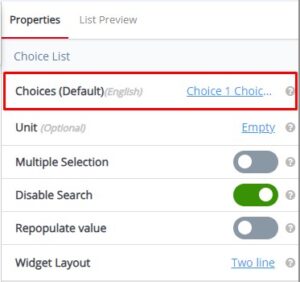 Choices (Default) values are Choice 1, Choice 2, and Choice 3. Use the Choices property to add a “Fixed List”. Example—Data Source is set to Fixed List. Add choices for Shift; i.e., First, Second, Third, Rotation. Use a return to place each choice on individual line. Example—Data Source is set to Reference List. Reference to property displays a drop down list of previously created lists. Select the list to be ‘referenced’.
Tooltip: Enter choices, one per line. Define the default list of choices for this field.
2. Unit
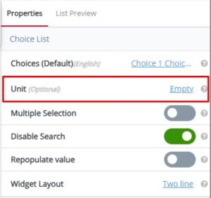 Unit is optional and default value is Empty. Use the Unit property to better define your choice list. Example—if you create a choice list of annual incomes, you can use the Unit to specify ‘dollars’ for a better understanding.
Tooltip: Specify the unit of measurement associated with the choices, providing context to users. This field is optional.
3. Multiple Selection
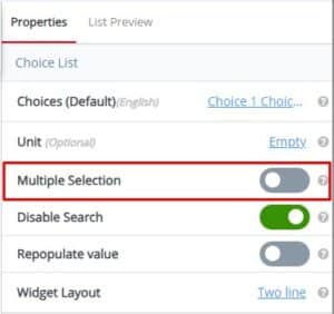 Multiple Selection default toggle value is No. Use the Multiple Selection property to allow the user to select one or more choices when filling out the workflow. Example—Multiple Selection set to Yes. When filling out the workflow, the user can select multiple selections from the choice list. A choice list displaying electronic appliances you own may include—refrigerator, microwave, washer, dryer, computer, etc. Multiple Selection set to yes allows selecting more than one choice. Note—Multiple Selection options include No and Yes.
Tooltip: Enable this option to allow users to select multiple choices from the list.
4. Disable Search
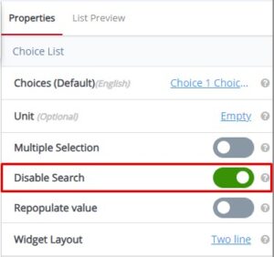 Disable Search default toggle value is Yes. Allow barcode or QR code scan for search option
Tooltip: Allow barcode or QR code scan for search option. Turn off the search functionality within the choices list, preventing users from searching for specific options.
5. Repopulate Value
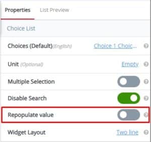 Repopulate Value default value is No. Use the Repopulate Value property to automatically repopulate (ditto) the previously submitted value. Example—Yes will remember the previously entered value and automatically populate the field every time a new Workflow is opened for data collection (user can manually change and this will become the new repopulate value); No will display the field blank every time a new Workflow is opened for data collection.
Tooltip: Should the value once entered, repopulate while filling the subsequent records? Activate this feature to automatically fill the field with its previous selected choices, ensuring data continuity.
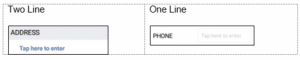
6. Widget Layout
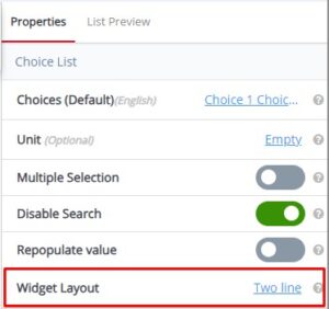 The Widget Layout default value is Two Line. Use the Widget Layout property to set to name (label) and value to a single line or two lines. Example—Two Line layout displays the widget name (label) on one line and the value (to be filled in) on a second line. One-Line layout displays the widget name (label) and the value to be filled in on a single line.
Tooltip: Allow widget name and value to be in single line or two line. Customize the visual arrangement and appearance of the widget for an enhanced user interface experience.
Choice List Widget—Common Properties
Choice List Common Properties include—Label, Font Size, Place Holder, Required, Unique, Unique Identifier, Auto Advance, Custom ID, On Value Change, Hidden, Read-Only, Help Expanded, Increase Indent By, Visibility Conditions and Validity Conditions. Reference Text Box Widget—Common Properties for definitions and examples.